The Design History of the Artichoke

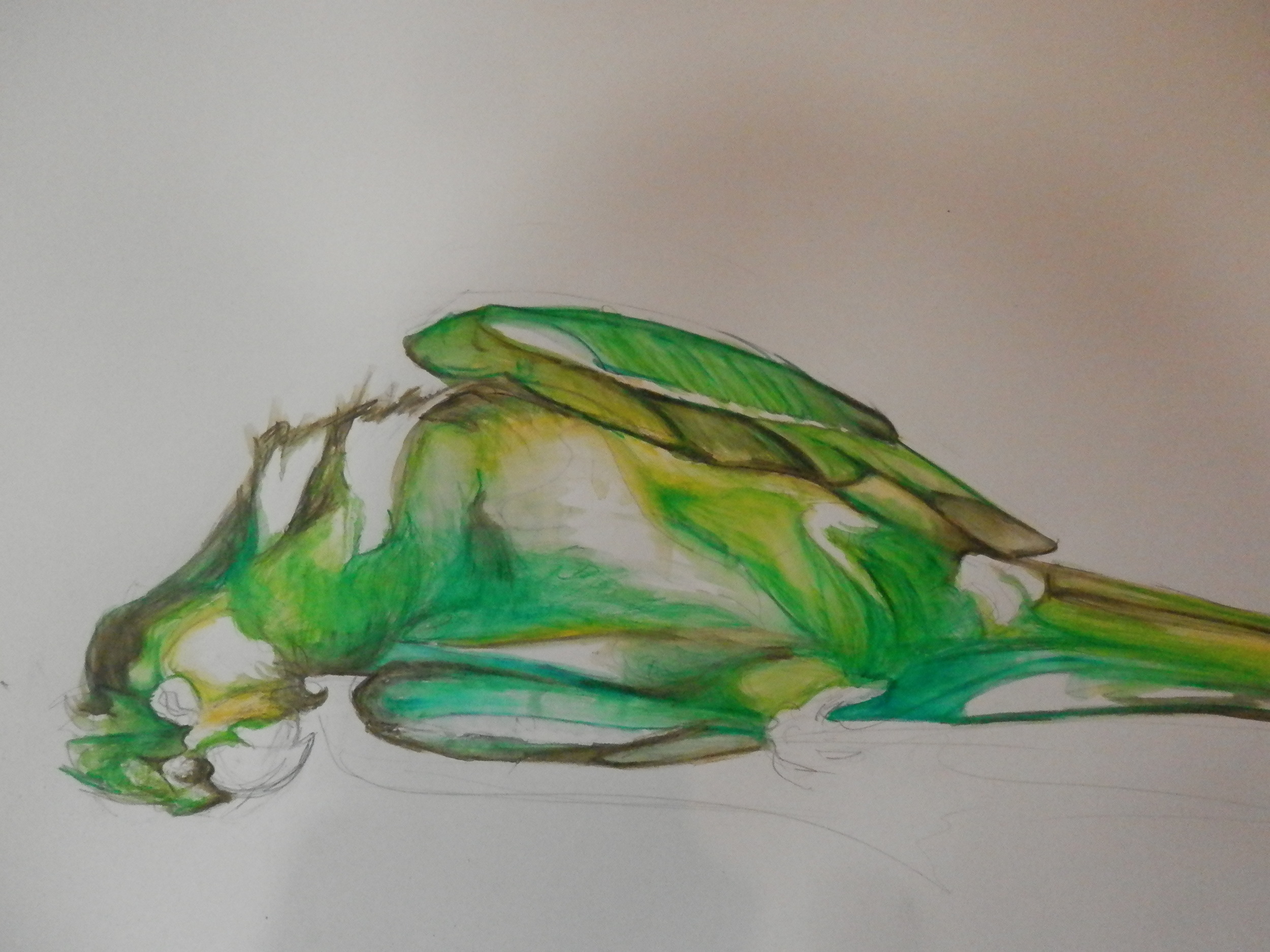
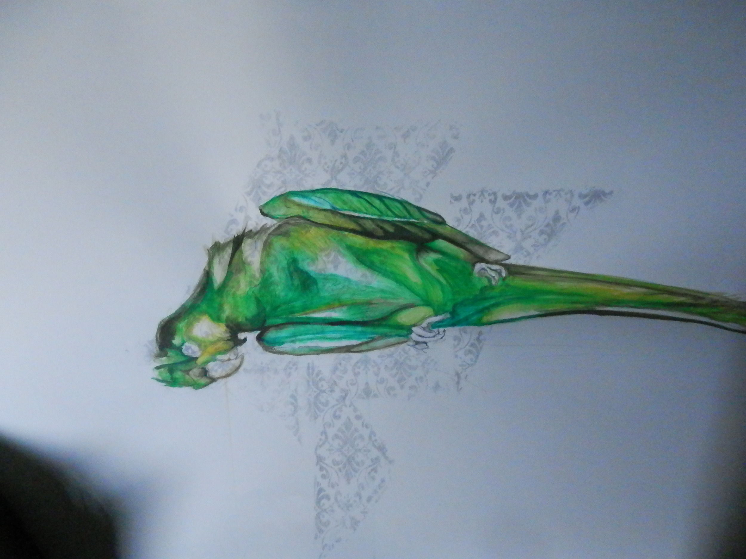
Il Motivo Sortico del Carciofo

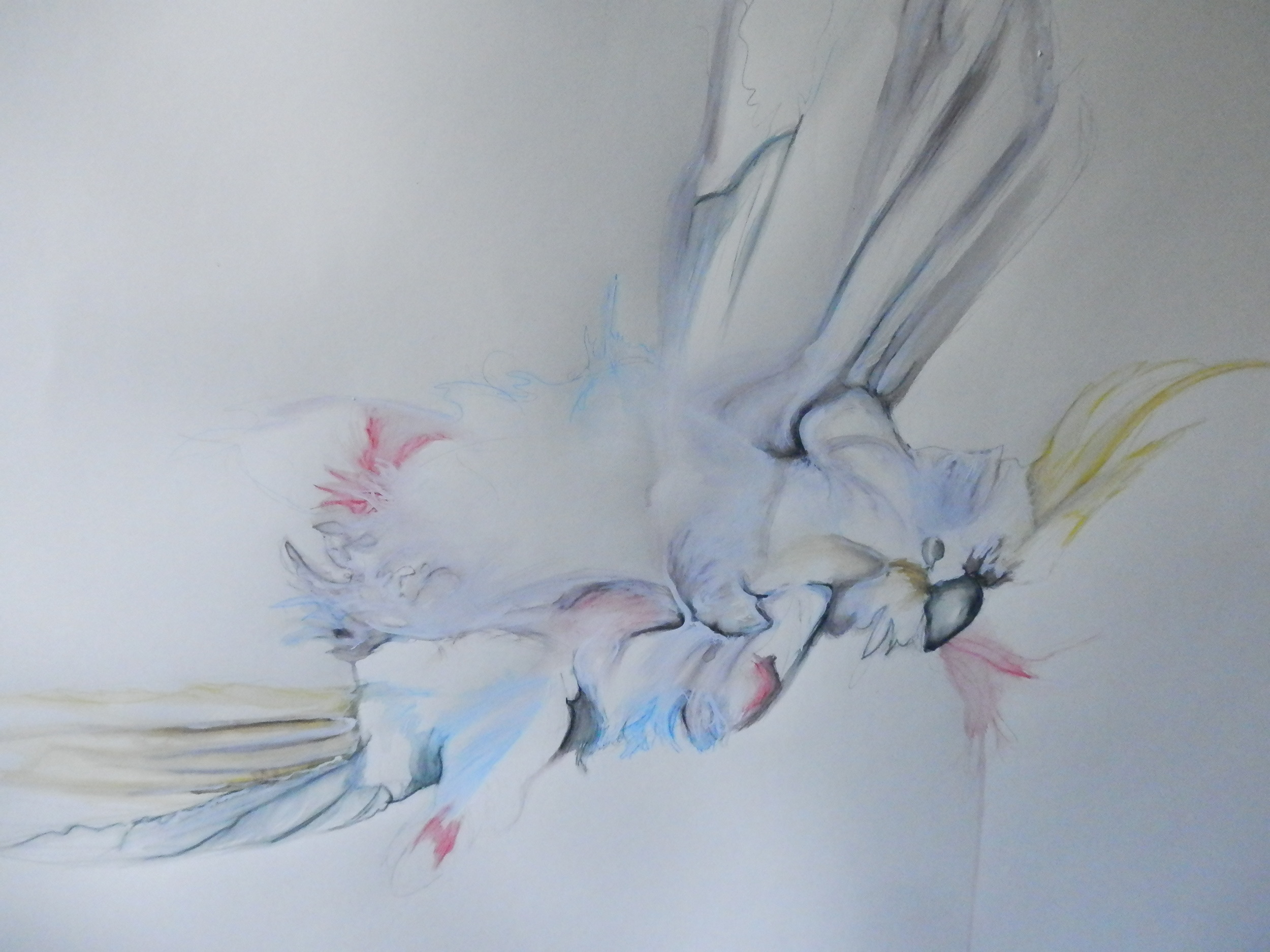
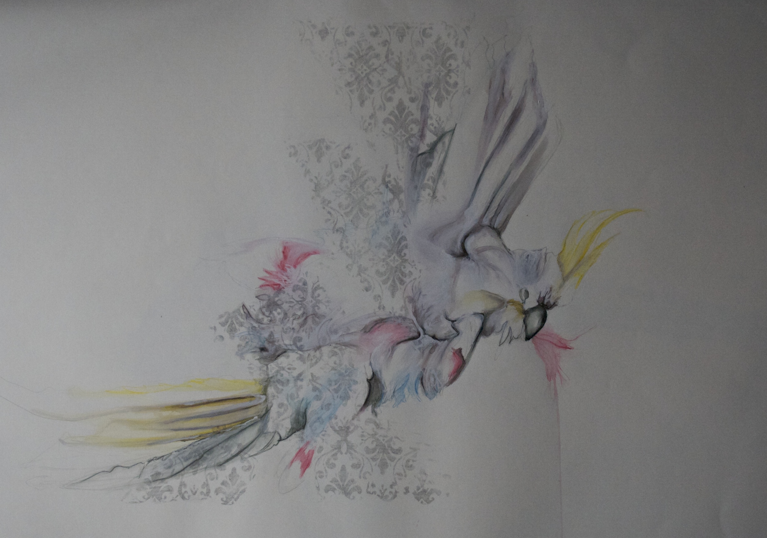
Once you fall in love with the layers and complexity of the Artichoke you begin to notice them intertwined everywhere.

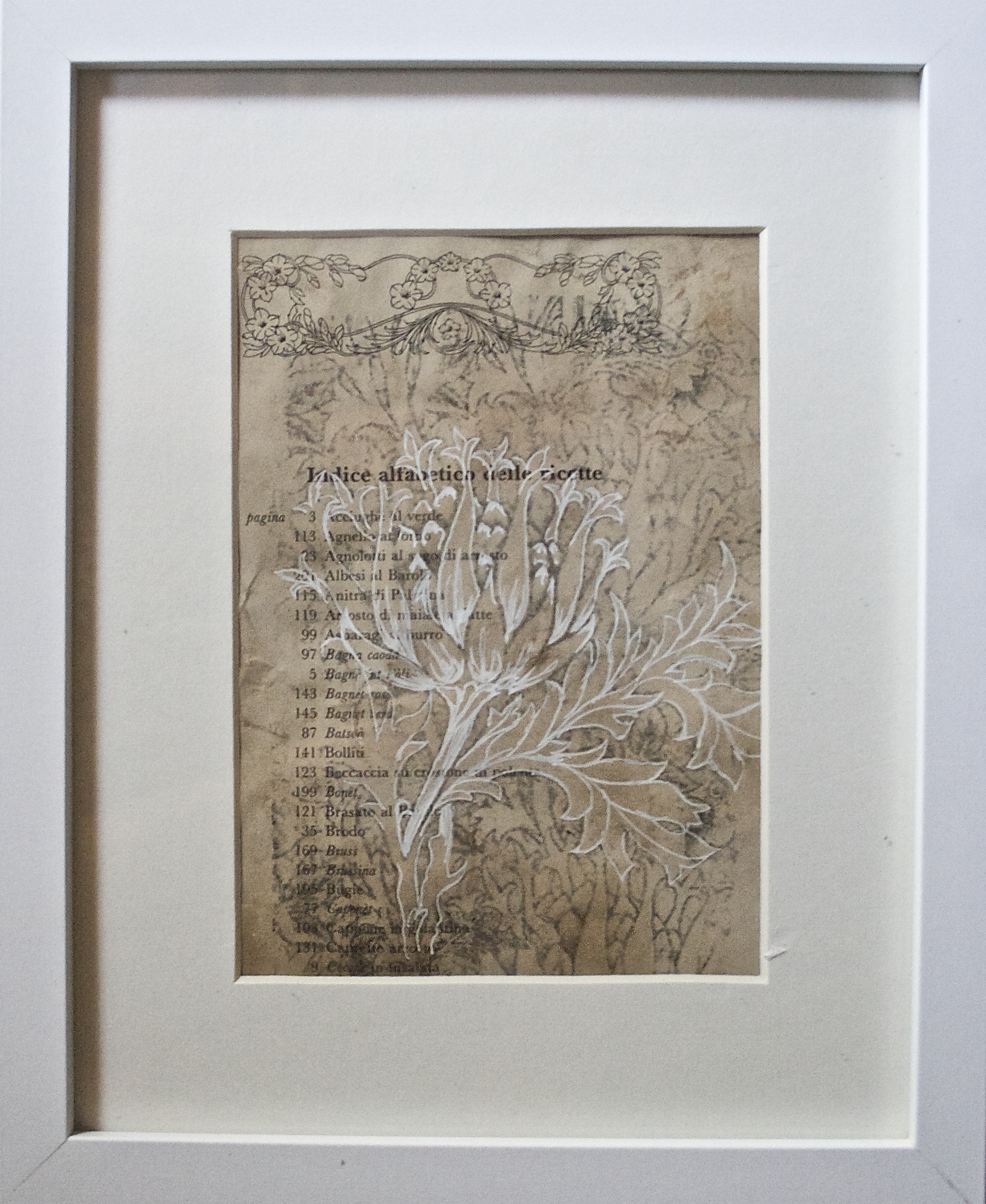
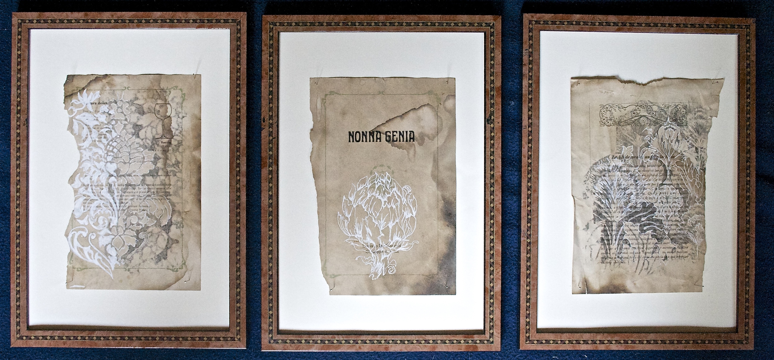
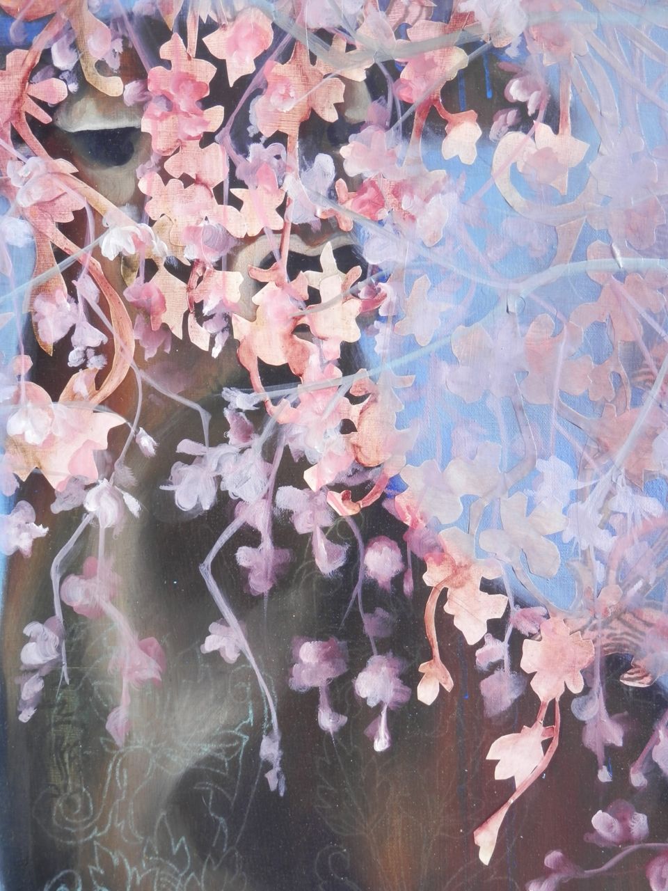
Having always been intrigued by print and pattern, I notice how often these esteemed vegetables where portrayed in artistic design over the years, particularly in the Art and Craft movement.

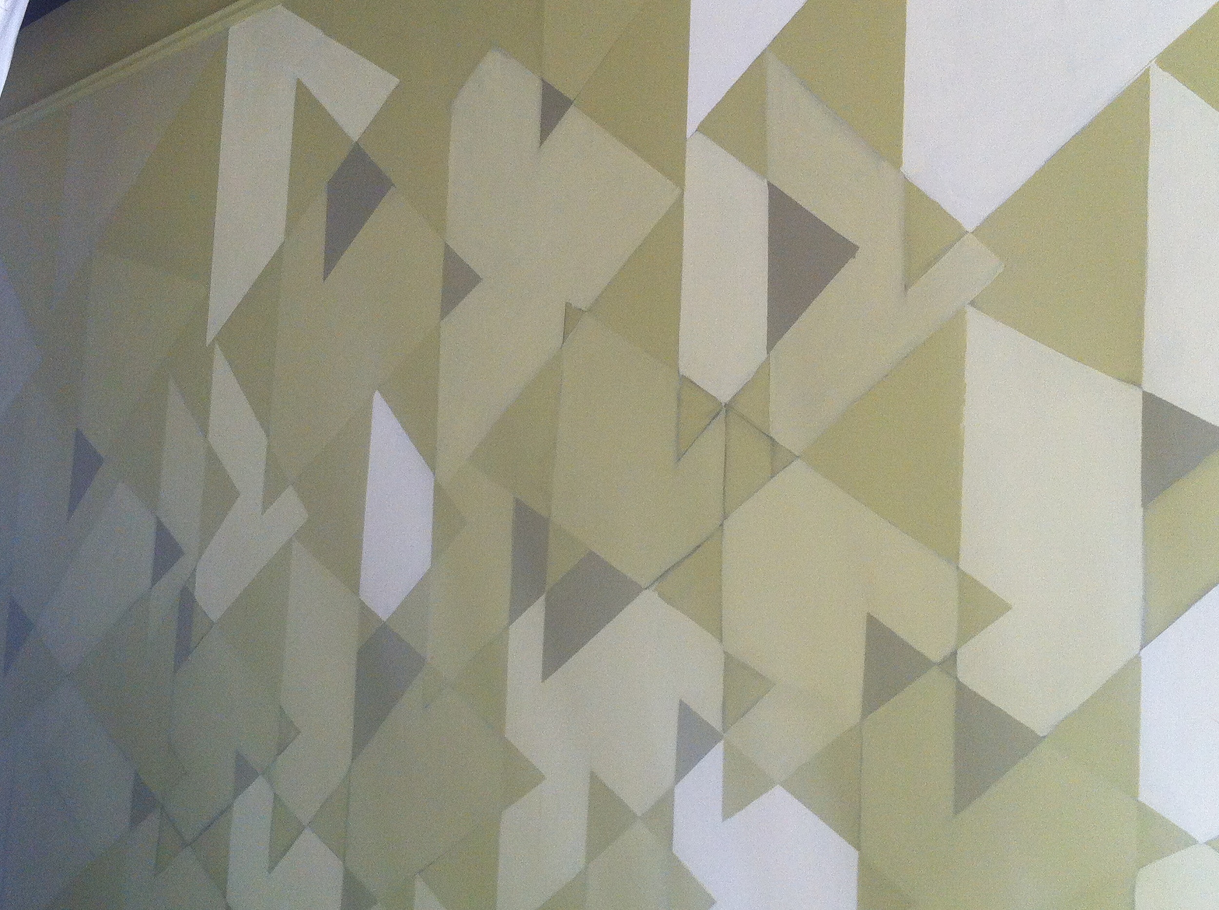
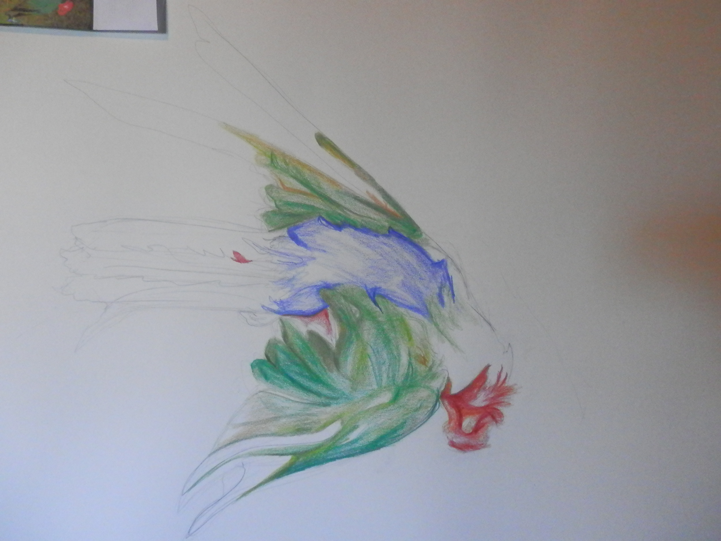
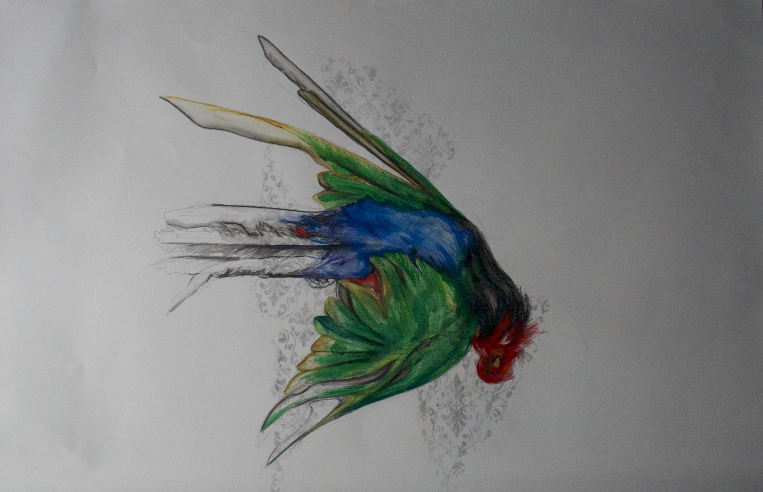
To pay homage to all things Artichoke I took reference from design greats such as Charles Voysey in the 1880’s to Timorous Beasties in the 1990’s.


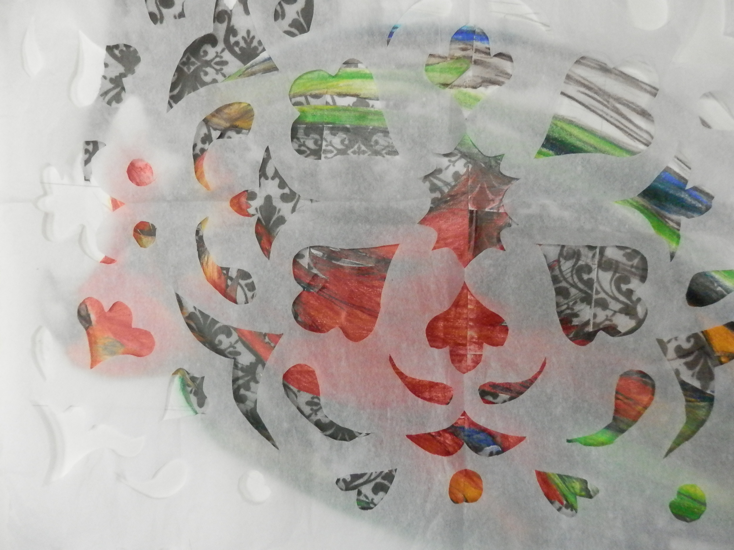
With the help of my Italian family I converted Nonna Genia's Piedmontese cookbook into illustrated snip-its of mock design history.

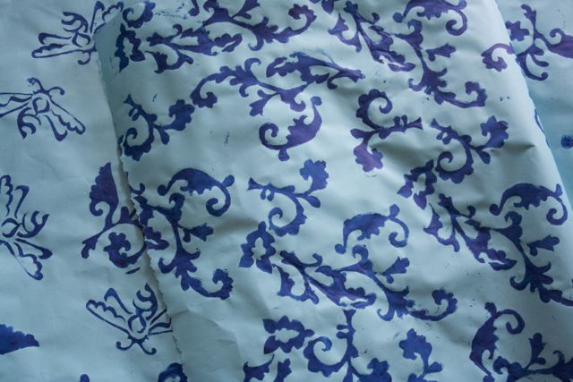
Aging the loose leaf pages beyond its years with stain, then using delicate white-ink patterns to expand upon the natural repetition I hoped to give you the scene of reverie, as if looking at a historical museum document, that this majestic plant deserves.


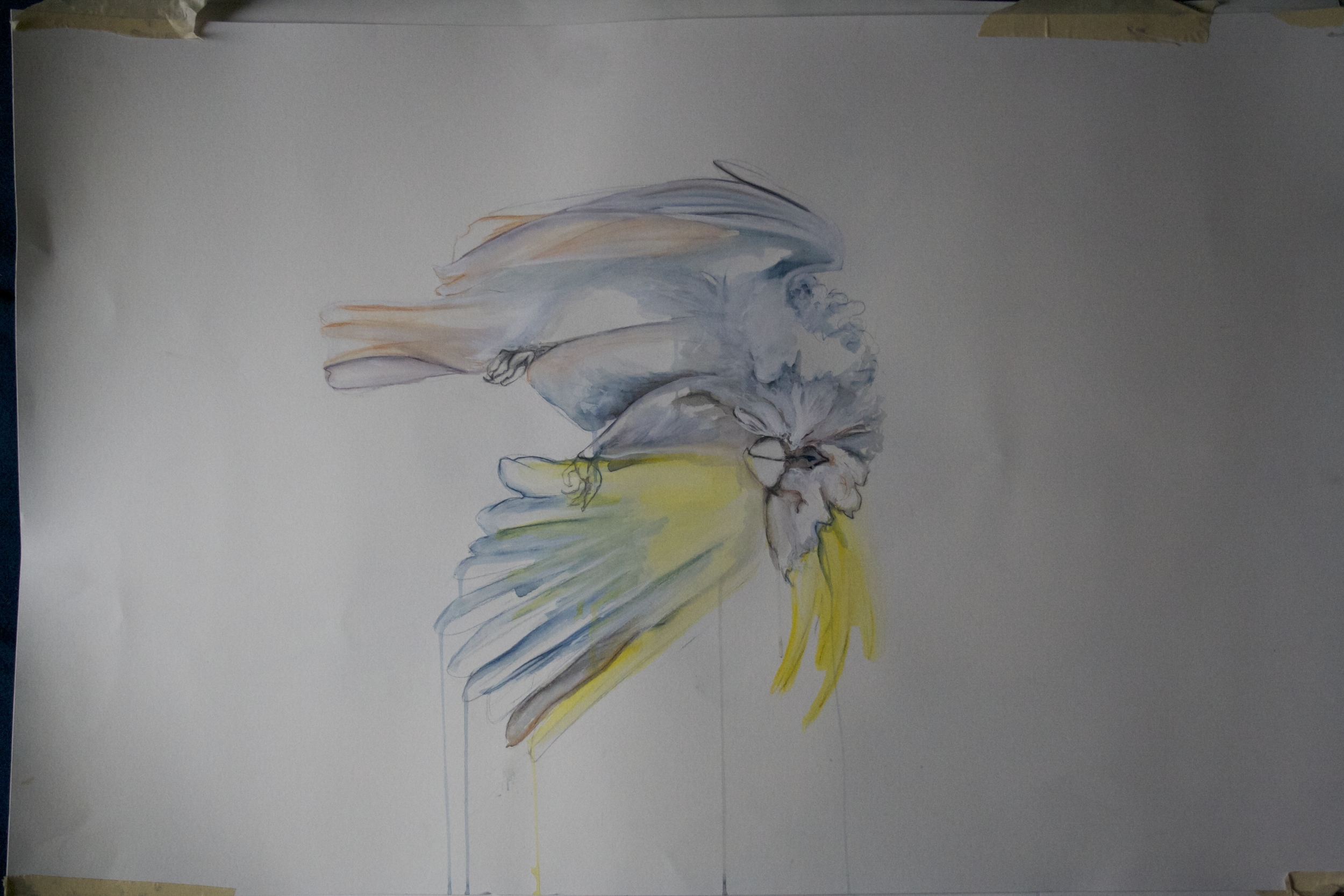
These drawings were made to be enjoyed specifically for Caffe Mingo in the height of Artichoke season, a time when summer is at its brightest, overflowing with lush bounty.


The Web World of Ellen Goldschmidt

I had the great pleasure of working with my fellow artist and dear friend  Ellen Goldschmidt on her new web site. I was a wonderful collaboration, an intimate way to get know her work, and learn from each other.

Plus it looks pretty sharp!! check it out!!

This could be the beginning of a whole new realm of aiding the artist of Portland.

A NOTE FROM ELLENDear Artist Friends,I'm excited to announce the launch of my new website,  ellengoldschmidt.comPlease take a look.  I built it from a template on Squarespace with the guidance, tutelage and genius teaching of my friend, ar…

A NOTE FROM ELLEN

Dear Artist Friends,

I'm excited to announce the launch of my new website,  ellengoldschmidt.com
Please take a look.  I built it from a template on Squarespace with the guidance, tutelage and genius teaching of my friend, artist Arielle Adkin.
As some of you know, I am NOT a techno wizard.  And yet, with Arielle's help, I was able to build a well designed, highly functional website that far exceeded my expectations.    I'm delighted with the outcome.

The best part is I learned what I need to know to manage the site from here on out by myself.  I did not pay an arm and a leg up front for a design and am not dependent on a designer to update the site.  Arielle has a great eye, is fun to work with and enjoys working with artists.  I highly recommend her services (arielleadkin@gmail.com).

Thanks for taking a look at my site.

Best,
Ellen

Portland Art Museum is Fashionable!! (who would have thought)

Our quaint museum is a lovely refuge with some great pieces but it is rarely hip let alone fashionable. Until recently when I wandered onto the basement level exhibition to be wonderfully surprised with the relevance and style of Two-Way Street the Photographs of Garry Winogrand and Jonathan Brand. With fashion being ever effected by the art of street photography in the countless blogs now: The SartorialistStreet Peeper,  All The Pretty Birds, to name a few. The photos in Two-Way Street are even more poignant to the realm of fashion over lapping with art. They do   capture the personality of the street while giving us a scene of nostalgia and texture of days past. The most fascinating part of all is that the fashion in many of these 1960's black and white photos could be mistaken for today. See what you think, show runs until August 24!

Note: I will be merging my fashion blog into my art blog! This Museum show only proved to me further that art/fashion belong together!

Week in Nostalgia

Almost nothing will give you permagrin quite like a BLAST from the past. This was me at Mississippi Studio watching the supreme bad ass chicks of Veruca Salt shred it up!

Memories and the powerful influence of music to mark time passing.

I am now ready to get rid of my last stash of cassette tapes and CDs.

What tares me up the most every time I move to get rid of these beat up chunks of plastic and joy is there very physical nature, Grunge had texture. That and the painstaking hours it took making them with hand written tracks and cover art included. They once were great treasures in  my life. In an effort to preserve all the texture and raw amateur design I am posting their images here for YOU and I to enjoy!

May you remember when you spent all day writing in sharpie on a shine plastic slice of COOL.

PS I even posted some of my favorites that made me less than cool. This shit is personal.

Recycled Rain Project

 The Recycled Rain Project was founded to help bring awareness to local artists and the various water issues facing both our state and other’s abroad.

For this group show I was required to use at least one mason-jar full of collected rain water. Being the over achiever that I am I thought I would take it to the next level with the use of  rain and shine.

For a Cyanotype, a photo graphic print, the exposure is made by leaving it to rest in the sun.On a partly cloudy Portland spring day the exposures is much longer.  To fix the print you rinse it in water, in this case collected buckets of rain water. The magic happens here and no matter what your images it the Cyanotype is always a beautiful variation of blue.

This is my process: starting with xerox transparency collage.

I made two pieces for the show and had the community vote on which piece should be in the show. The last image is the one that made the cut.

SPRING and The Grand Budhapest Hotel

Checking Out, Vouge

&

The Grand Budapest Hotel

If any art form was going to rival and beat Wes Anderson to the punch it would be Vogue. 

 This fantastical photo shoot show cases the best couture of Spring published in Vogue March 2012. This was published just as couture was become revitalized with new energy and wonder. Frothing like a french pastry the shoot lets Kate Moss show off her amazing skills while paying homage for the Ritz Hotels closure in Paris. 

All this striking imagery reminded me of the best visual movie of the year: The Grand Budapest Hotel. 

With visual luxuries,  grand dame/supper model, love, and a historic tend setting hotel. 

What more could you need to set your spring fashion imagination soaring?

San Francisco made my Art -Heart skip a Beat

Every time I go to San Francisco I love it even more!

This last trip was a short one but oh so perfect. It truly was a four-day art immersion. While planning my trip I had my doubts that I was going see the high quality of art that I have come to revere in that Bay town. The SFMO is closed for awhile and a lot of the Geary Street Galleries have moved or closed.

In an ever changing city scape you need an insider to guide you. I was lucky enough to meet just that person. Alicia Escott a friend, of a friend, met us all for drinks at Bourbon and Branch where we discussed the art scene at large. Topics ranging from what is happening locally in San Francisco, to comparisons between Portland (our lack there of) and all about what she is making right now! For a first time art bonding it was the most one could ever want!

The next day she sent me a long list of must see art sites and so I set out to navigate these tucked nooks and carnies. If it's one thing I learned about galleries in different cities, ether they are flaunted like intimidating shinny marbles or the disguised so cleverly you can easily walk right by the unmarked door. San Francisco is mostly the later. So, it makes all the difference if you know where you are going. Thank you again, Alicia!

Overall, I saw way more than my eyeballs could contain and I left with a heavy heart full of inspiration and desire. What follows is a list of the best of the galleries I saw and there imitate neighborhoods:

Down Town:

111 Minna features artist that have that illustrative/ street art style down. Much like Juxtapose or Hi-Frutose. Very youthful a modern approach to a gallery with a lively event space and coffee shop.

Patricia Sweetow a last standing great of the Geary Gallery blocks. It is not as stuffy, with bright swaths of color and joy. My favorite works there where paintings made entirely of glitter. You could tell these artist featured where further in their careers but were pulsing with vitality. Pushing materials to there (almost cheesy) soaring heights! (couldn't find glitter artist online but if anyone know there name tell me.)

SoMa:

Jessica Siverman Gallery  This gallery is pretty posh and shiny, considering it's outside landscape, nearing the Tenderloin. This is contemporary art flexing it intellect with large scale works By Matt Lipps "The Populist Camera" that drew form art history. I was not an emotional show but one of a continued dialog of visual Libraries.

Bash Contemporary  In the similar vain to 111 Minna this was young contemporary with a heavy does of masculine grotesque, a more kick in the teeth street art style. Again, close to the Tenderloin a duoses of this bad-ass vibe lets you feel adventitious enough to try the Pakistani food around the corner.

Deeper into SoMa Where two great galleries:

1amsf This was amazingly fun gallery with a friendly staff member and a more integrated approach to the street art scene with graffiti artist that showed off with great skill their applicability to make fine art as well. The show I wittiness entitled "a MA-JOR minority" had small works by approx 50 artist, a feast for our eyes. My artist friend and I were delightfully overwhelmed. Another great take away from 1amsf  is this galleries' APP, called 1AM it works as an Instagram like tracker for art instillation on the streets telling you what is near or allowing you to socialize with your own photos of cleaver tags.

Alterspace Talk about unmarked door. This charming little space contains makers that dapple in the political realm. I was lucky enough to see Alica Escotts' work draped in the window, her lite butterfly piece on recycled plastic was an inspired balance of politico and finery.

New HOOD for galleries:  FUSED SPACE 

This was a fun new area of San Francisco to explore a lot of industrial works shops and large spaced galleries. My dear friend that works near by was kind enough to meet me for coffee as we waxed about comparisons between where we were standing (a stumptown coffee cart) and the beginnings of "The Pearl" in Portland.

Hostfelt Gallery

This was the best in this hood. It was such a large space and contained two such completely different artist, that it could have been separate galleries. The fact that they were so different only strengthened there visual intrigue, keeping me refreshed and engaged for over an hour. The first artist I saw at Hostfelt Gallery was Reed Danziger "The Edge of Chaos" . His work has an ascetic, in light, graphite, gouache, mixed media, that matches my current material process. Then, Ben McLoughin "Night Sky"  paintings varied such in size that they told a beautifully haunting story that you as a viewer experience tiny vignette of intimacy and vast landscapes of solitude.  His delicate story telling coupled with the soft clouds of oil paint made me want to paint in oil again!

Clark Gallery Featured a political show about how we live with and process our food, with the added element of a an scheduled art dinning event looming for later. I was flatted by acheiveing "local status" with my own friendly invite. But the true art treasures of this gallery were stored in the backroom, in particular a  Juile Heffernan piece. She has been one of my long time favorite painters.

Right next door where  Bright happy squares at Brian Gross

Just up the street George Lawson Gallery with a show featuring large abstract, gestural, portraits. Right next door is Jack Fisher Gallery. This was one of my must stops on previous trips in it's old location on Geary street and will continue to be a must in its' new location. The main exhibition was not to my taste, this time, but there was such a great variety of well edited artist in the backroom I was more than satisfied.

The Mission:

The day I spent in the Mission was Monday so most galleries were closed. But do not feel sorry for me, the sun was beaming....So burritos at La Taqueria followed by giant macaws in Daloris Park got me though the day until I found...

Camp Fire Gallery part retail space, mostly gallery. A charmingly detailed shop.

NOLA Now I KNOW

This town is real.

Such a great art scene in this vibrant city of texture & history. These are my favorites artists and take a ways, plus a few of my own photos of the trip.

Brian Borello actually a Portland Artist

Teresa Cole, Nora Lovell, ED Smith, Hanna Chalew

Even a few of the galleries in the overly touristy french quarter were great:

TRESOR , Gallery Orange,

Mel Chin 

Is the toast on New Orleans art scene this month the a solo show at Jonathan Ferrarra contemporary gallery and a huge retrospect at NOMA entitled “Rematch.” I got to really delve in to his work and I was completely taken away. His work is very thought provoking without being to political, using element of myth history and artifact. The pieces and instillation's themselves were simple, beautiful and yet transportive. His work was very much influenced by Joseph Cornell and Marcel Duchamp, but really he picks up where Duchamp left off, challenging the viewer but leaving them with the sublime;

"Beauty is only the fist touch of terror we can still bear and it awes us so much because it is so coolly disdain to destroy us." -Jung quote used in conjunction Mel Chin's "Rike's Razor" a straight razor with the blade cut in the shape of the solute of Venus De Milo.

The other piece that greatly impacted me was an installation entitled "Operation of the Sun Through the Cult of the Hand” a mini universe with the planets represented in their elemental forms.


MY STREET VIEWS OF NEW ORLEANS!

Buckman Art Show and Sell

I am ready! All is prepped and tagged for my booth!

This could be the beginning of a Nomad's paper and art shop. Stay tuned.

If you are in Portland stop by the Art Fair @ Buckman Elementary School

part of the money goes back to support ARTS in the schools!

GRUNGE for a Northwest Winter (we invented it for a reason...)

 ...the reason this season is the rain! here in the great mist green of the northwest we always need the layers, always needing boots and always needing a hood or a large scarf to pull over your head to keep those droplets off. But all of these challenges are no excuse to dress like a perma-hiker or a slob, Grunge takes effort or at least thought to how you put these elements together. Bad Ass and ready to conquer the slippery asphalt with a fierce style.
note: more pants!

The Master of Animals and Fireworks

This is one my all time favorite artist.

Using Nature as theme he create a palatable beautiful amount of tension in this work. Creation living along side destruction and unbridled instincts existing together. The closest permanent instillation to a Portland dwellers is at the Seattle Art Museum, where he installed full size "exploding" firework white Fords.

What follow are images form his new show and an essay a wrote when I first saw his work in collage.

http://www.caiguoqiang.com/

Constant Complicated Time of Destruction and Creation

“We live in complicated times.” is the opening statement made in the promotional brochure for the work of Cai Guo-Qiang showing at Site Santa Fe. However, this work entitled ‘Inopportune’ is not necessarily about this general cliché statement. Cai Guo-Qiang’s artwork including the use of scale, material and subject matter speaks profoundly more to the idea that destruction is creative and beautiful.

Material is one of the strongest aspects of Cai’s work that resonates with the ideas of positive destruction. He works with fireworks, the quintessential controlled explosion made to invoke beauty and celebration.  Cai paints the sky with choreographed firework displays, films a car being destroyed by colorful explosives, and most astounding Cai gives the viewer lasting evidence that these highly temporal explosives can create lasting images with his gunpowder drawings on Japanese rice paper. Had these “drawings” been made by any other means they would never capture the power of ethereal destruction, an act of explosion that is impermanent and performance based.

He also employs a thematic use of subject matter in ‘Inopportune’. Images tigers and car are repeated over and over in Cai’s work. The tigers call up references to exotic myths and heroism, a glorified destruction, while cars reference the true life of destruction on a daily bases: car bombs car crashes. The use of tigers was an extremely eloquent choice to show the beauty of a certain kind of destruction, hunting, and an extension. Had Cai use the human body, for example, instead of tigers the viewer would have been far less involved. We are desensitized to that type of imagery and most of us can feel stronger compassion for an endangered species. The car imagery installs in the viewer a more threatening since of destruction as if a car bombing could happen to you.

White as Winter White as Paper

The following looks are all about the trendiest of non-colors 
to wear for winter, the clean the fresh white. 
The article below is about using paper techniques, such as origami,
to create structured dimension in clothing. 
It come out via Vogue a few season before the resurgence of minimalism dressing
 which still makes use of strong angles edges and detail much like the crisp folding of a paper.


Months Gone By

This is how I have spent the last few years building up layers and exploring the nature of all things deer.

The romance of the chandelier becomes much more about line and delicate translucent layers.

"January" 2012 oil, acrylic gel gloss, paper on canvas 23"x 36 ”

  Little white flowers are just the right finishing touch.

"April" 2012 oil, acrylic gel gloss, paper on canvas 23"x 36 ”

All things covered, in the thicket. "April" 2011 oil, acrylic gel gloss, paper on canvas 23"x 36 ”